Accessibility isn't a ranking factor — but it lives in the same HTML
Let's be honest up front: Google has never said accessibility is a ranking signal. You won't find "WCAG compliance" in any ranking documentation, and a perfectly accessible page can still rank badly if the content is thin.
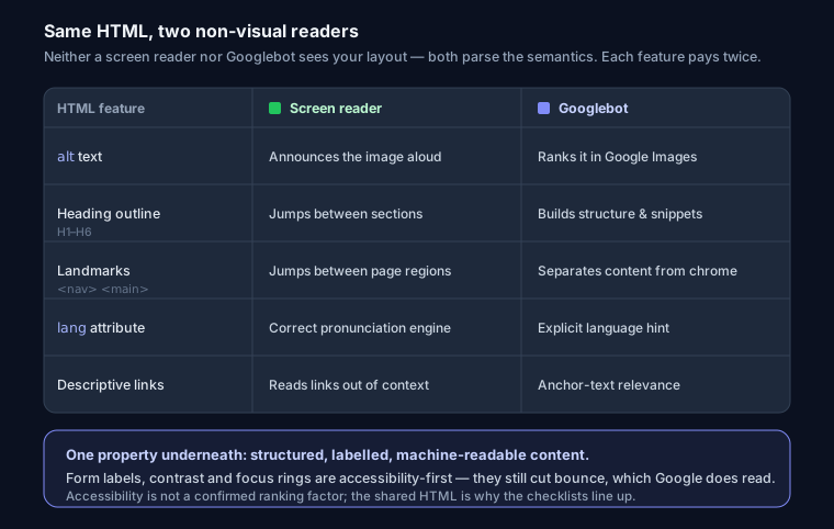
So why does every serious technical SEO checklist include accessibility? Because the two disciplines read the same source. A screen reader and Googlebot are both non-visual consumers of your page. Neither sees your carefully art-directed layout — they parse the DOM, the semantics, the text alternatives, the heading outline. When you write HTML that a blind user can navigate, you've also written HTML that a crawler can parse and represent cleanly in search results. The overlap isn't a coincidence; it's the same underlying property: structured, labelled, machine-readable content.
There's a third reason that has nothing to do with rankings and everything to do with your budget: legal risk. In the US, ADA lawsuits over inaccessible websites run into the thousands per year, and WCAG 2.1 AA is the de facto standard courts reference. The EU's European Accessibility Act carries similar obligations. Fixing these 15 things is cheap. A demand letter is not.
Here's the checklist, grouped, with the why for each and the code that actually matters.
Images (checks 1–3)
1. Every meaningful image has descriptive alt text. 2. Decorative images use alt="". 3. Images declare width and height.
Alt text is the single clearest place SEO and accessibility converge. A screen reader announces it; Google Images uses it to understand and rank the image; and if the image fails to load, the browser shows it. The distinction that trips people up is decorative vs. meaningful. A hero flourish or a background texture should have an empty alt (alt="") so screen readers skip it — but the attribute must be present. Missing alt entirely makes the reader announce the file name ("hero-final-v2-1920.jpg"), which is useless.
<!-- Meaningful: describe what it shows, no "image of" prefix -->
<img src="/chart.png" alt="Organic traffic rising 40% from Jan to June 2026"
     width="800" height="450">

<!-- Decorative: present but empty, so it's skipped -->
<img src="/divider.svg" alt="" width="120" height="4">
The width/height attributes do double duty: they reserve layout space (preventing Cumulative Layout Shift, a real Core Web Vitals metric) and give assistive tech a stable box. For the full treatment of file formats, lazy loading, and alt-text patterns, see the image SEO guide.
Headings (checks 4–6)
4. One H1 per page. 5. Logical hierarchy — no skipped levels. 6. Headings carry the real topic.
Headings are the outline of your document. Screen-reader users navigate by pulling up a list of headings and jumping between them — if your outline is broken, so is their navigation. Google uses that same outline to understand structure and often to build featured snippets. Skipping from an <h2> straight to an <h4> because <h4> "looks the right size" breaks both. Style with CSS; structure with the correct tag.
<h1>Web Accessibility & SEO Checklist</h1>
<h2>Images</h2>
<h3>Alt text rules</h3>
<h2>Headings</h2> <!-- back up to h2, don't jump to h4 -->
<h3>Hierarchy</h3>
One H1 states the page topic; everything nests under it. This gets its own deep dive in the H1-H6 heading hierarchy guide — worth reading if your CMS auto-generates headings.
Forms (checks 7–9)
7. Every input has a label. 8. Required fields are marked. 9. Errors say what's wrong.
A bare input with only placeholder text is invisible to a screen reader once you start typing, and placeholder contrast is usually too low to read anyway. Tie a <label> to its control with for/id, or use aria-label when there's genuinely no visible label (an icon-only search box, say).
<label for="email">Email address</label>
<input id="email" type="email" name="email" required aria-required="true">

<!-- No visible label? aria-label carries the accessible name -->
<button aria-label="Search">🔍</button>
Mark required fields with the native required attribute (it also gates submission) and, for older assistive tech, aria-required="true". When validation fails, "Error" tells nobody anything — write "Email is required" and wire it to the field with aria-describedby so the reader announces it. Better forms mean lower abandonment, which feeds the engagement signals Google does care about.
Navigation (checks 10–12)
10. A skip link. 11. Landmarks. 12. Full keyboard operability.
A skip link is the first focusable element on the page and lets keyboard users jump past a 40-link nav straight to content. It's usually visually hidden until focused:
<a href="#main" class="skip-link">Skip to main content</a>
...
<main id="main">...</main>
.skip-link { position: absolute; left: -9999px; }
.skip-link:focus { left: 1rem; top: 1rem; }
Landmarks let screen-reader users jump between regions. You almost never need explicit ARIA roles here — the native HTML5 elements carry implicit landmark roles already. Prefer them:
<header>...</header>   <!-- role="banner" -->
<nav>...</nav>         <!-- role="navigation" -->
<main>...</main>       <!-- role="main" -->
<footer>...</footer>   <!-- role="contentinfo" -->
Reach for role="navigation" only if you're stuck supporting a markup structure you can't change. The first rule of ARIA is: don't use ARIA when native HTML does the job. Those same semantic elements help Google distinguish your primary content from boilerplate chrome.
Keyboard operability is the acid test — tab through your whole page. Every link, button, and control must be reachable and activatable without a mouse, and never trap focus. If you built a "button" out of a <div> with an onclick, it won't be tabbable or announced as a button; use a real <button>.
Content (checks 13–15)
13. lang attribute. 14. Sufficient contrast. 15. Readable, descriptive text.
Set the document language so screen readers pick the right pronunciation engine and Google gets an explicit language hint:
<html lang="en">
Contrast has hard WCAG AA thresholds: 4.5:1 for normal text, 3:1 for large text (roughly 18.66px bold or 24px regular and up) and for UI components. Light-grey-on-white "subtle" captions are the most common failure. There's no SEO penalty for low contrast directly, but users who can't read your text bounce — and bounces are a signal.
Add a visible focus indicator — check 12's companion. Never outline: none without a replacement. :focus-visible gives you a keyboard-only ring without showing it on mouse clicks:
:focus-visible {
  outline: 3px solid #4f9cff;
  outline-offset: 2px;
}
Finally, descriptive link text. "Click here" and "read more" tell a screen-reader user (who often browses by pulling up a list of links out of context) nothing — and they're wasted anchor text. Anchor text is a genuine internal-linking SEO signal: [free SEO audit tool](/) passes topical relevance that "click here" throws away. Write the link so it makes sense read alone.
<!-- Bad: dead anchor -->
<a href="/blog/heading-hierarchy-seo">Click here</a>

<!-- Good: describes the destination, useful anchor text -->
<a href="/blog/heading-hierarchy-seo">how heading hierarchy affects SEO</a>
How to actually test this
Don't eyeball it. Run these, in order of effort:
- Lighthouse Accessibility audit — built into Chrome DevTools. Fast, catches contrast, missing labels, missing alt, and heading order. Chase the 100 the same way you would for performance (getting Lighthouse to 100).
- axe DevTools (browser extension) — deeper, fewer false positives, explains each violation with the WCAG reference.
- A keyboard-only pass — unplug the mouse and tab through. This catches focus traps and unreachable controls that automated tools miss entirely. Roughly a third of issues are only findable this way.
If you want accessibility and SEO checked together in one pass, run your URL through the analyzer — it flags these accessibility issues alongside the SEO ones and points at the specific fix. Building trust signals matters too; the E-E-A-T guide covers the credibility side.
FAQ
Does Google rank accessible sites higher? Not directly. Accessibility is not a confirmed ranking factor. But accessible sites tend to have cleaner semantic HTML, better mobile usability, and lower bounce rates — all of which do influence rankings indirectly.
Is alt text an accessibility feature or an SEO feature? Both, and it's the clearest example of the overlap. The same string serves a screen reader and Google Images. Write it for a human describing the picture; the SEO benefit follows.
Do I need ARIA roles if I use <nav>, <main>, <header>, <footer>?
No. Those elements already carry the matching landmark roles. Adding role="navigation" to a <nav> is redundant. Use native HTML first; reach for ARIA only when no native element fits.
What's the minimum I should target? WCAG 2.1 Level AA. It's the standard courts and regulators reference, and it maps almost exactly to this checklist.