If Lighthouse flags "Image elements do not have explicit width and height," it means your images have no reserved space — so the page jumps as they load. That jump is measured as Cumulative Layout Shift (CLS), a Core Web Vitals ranking factor.
Why It Matters
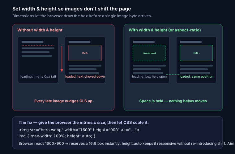
Without dimensions, the browser does not know how much space an image needs until it downloads. Content below it shifts down when the image appears — frustrating users and hurting your CLS score.
A good CLS is under 0.1. Missing image dimensions is one of the most common reasons sites fail it.
The Fix: Always Set width and height
Add the intrinsic (natural) pixel dimensions as attributes. The browser uses the ratio to reserve space before the image loads:
<img src="hero.jpg" width="1200" height="630" alt="Product dashboard">
You do not need to display it at that size — pair it with responsive CSS:
img {
  max-width: 100%;
  height: auto;
}
The width/height attributes give the aspect ratio; the CSS makes it responsive. Together they reserve space and prevent the shift.
In Next.js
The next/image component handles this automatically when you pass width and height (or fill):
import Image from 'next/image';

<Image src="/hero.jpg" width={1200} height={630} alt="Product dashboard" />
For Background Images
CSS background images do not cause CLS the same way, but if you use them for meaningful content, reserve space with aspect-ratio:
.banner {
  aspect-ratio: 16 / 9;
  background-image: url('banner.jpg');
  background-size: cover;
}
Checklist
- Add
widthandheightto every<img>. - Use CSS
max-width: 100%; height: auto;for responsiveness. - Reserve space for ads, embeds, and dynamic content too.
- Avoid inserting content above existing content after load.
Confirm It
Run your URL through SEO Snapshot — it checks images for missing dimensions and alt text, and flags Core Web Vitals risks like layout shift.
FAQ
Q: Do I still need width and height if my CSS already sets the image size? Yes. CSS controls the rendered size, but the browser needs the width and height attributes (or a CSS aspect-ratio) to know the shape before the image downloads. Without them it reserves zero space and reflows the page once the file arrives, which is exactly what causes layout shift.
Q: What values should I put in width and height? Use the image's natural (intrinsic) pixel dimensions — the actual file size, like 1600 by 900 — not the size it appears on screen. The browser only uses the ratio between them to reserve space, then max-width: 100% and height: auto scale it to fit the container.
Q: Will adding width and height break my responsive layout? No. as long as you pair the attributes with CSS max-width: 100%; height: auto;. The attributes set the aspect ratio, and the CSS lets the image shrink to fit smaller screens while keeping that ratio, so it stays fluid and shift-free.
Q: How do I stop layout shift on CSS background images? Background images ignore width and height attributes, so reserve space with the CSS aspect-ratio property (or a fixed min-height) on the element. That keeps the box a stable size before the image loads and prevents the surrounding content from moving.